San Lucas — Improving Patient Journeys for a Healthcare Platform
Focused on improving patient journeys for a healthcare platform based in Dubai—using research, branding, and interface design to create a clearer, more accessible, and action-driven experience.
Type:
Client
Role:
UX/UI Designer
Timeline:
Focus:
UX/UI Design · Branding
Overview
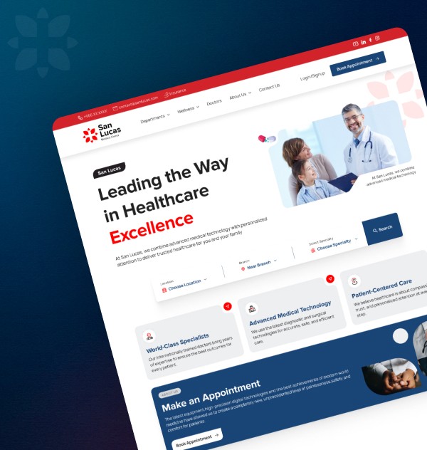
San Lucas, based in Dubai, required a complete redesign to improve usability and build a more trustworthy and structured experience. The existing platform was outdated, hard to navigate, and lacked clarity across key interactions.
The goal was to simplify how patients book appointments, access information, and interact with the platform—aligning the experience with modern healthcare and booking standards.
Challenges
The existing experience created friction across key patient actions:
Unstructured Navigation: Information was scattered, making it difficult for users to find relevant services
Complex Booking Flow: Appointment booking lacked clarity and required unnecessary steps
Lack of Familiar Patterns: The experience didn’t follow expected booking or e-commerce interaction models
Inconsistent Interfaces: UI patterns varied across pages, reducing trust and usability
Approach
Starting with research and competitive analysis, I identified usability gaps and mapped them into clearer flows and navigation.
Through iterative sprints and feedback, I refined the experience while collaborating with designers, developers, and branding teams to ensure consistency and scalability.
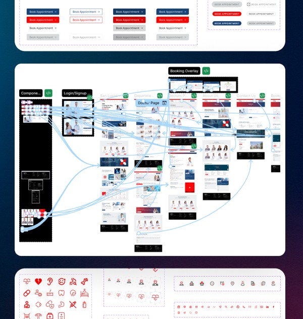
User Flows: Simplified complex journeys into clear, task-focused actions
Validation: Refined designs through feedback and usability testing
Design System: Built a scalable UI system using components, tokens, and variables
Key Decisions
Focused on improving usability, consistency, and conversion:
Booking First Experience: Positioned appointment booking as a primary action to reduce drop-offs and increase engagement
Familiar Interaction Patterns: Aligned flows with common e-commerce and booking behaviors to reduce cognitive load
Clear Information Hierarchy: Structured content for quick scanning and easy navigation across services
Design System with Variables: Built a scalable system enabling responsiveness across desktop, tablet, and mobile without redesigning screens
Developer-Friendly CMS: Created a structured system to help developers manage content and profiles efficiently
36+
Wireframes & Flows
25
Screens Designed
20+
UI Components
Impact
Faster Booking Flow: Reduced steps and friction in appointment booking, making it quicker for users to complete key actions
Improved Navigation Clarity: Clearer structure helped users find information without confusion or backtracking
Higher Engagement: More visible and accessible CTAs increased interaction with core actions like booking and exploration

The platform now feels more structured, easier to navigate, and aligned with modern healthcare expectations after iterative design sprints.

Tasleem Mohamad
CEO, Creative Expert | The Pixel Mark
Conclusion
San Lucas is currently moving into development with a clearer structure and simplified user flows in place, focused on refining the interface and validating the experience through real-world usage and iterative testing.
/ More Works


Let’s build something meaningful
Open to product roles, collaborations, and conversations
San Lucas — Improving Patient Journeys for a Healthcare Platform
Focused on improving patient journeys for a healthcare platform based in Dubai—using research, branding, and interface design to create a clearer, more accessible, and action-driven experience.
Type:
Client
Role:
UX/UI Designer
Timeline:
Focus:
UX/UI Design · Branding
Overview
San Lucas, based in Dubai, required a complete redesign to improve usability and build a more trustworthy and structured experience. The existing platform was outdated, hard to navigate, and lacked clarity across key interactions.
The goal was to simplify how patients book appointments, access information, and interact with the platform—aligning the experience with modern healthcare and booking standards.
Challenges
The existing experience created friction across key patient actions:
Unstructured Navigation: Information was scattered, making it difficult for users to find relevant services
Complex Booking Flow: Appointment booking lacked clarity and required unnecessary steps
Lack of Familiar Patterns: The experience didn’t follow expected booking or e-commerce interaction models
Inconsistent Interfaces: UI patterns varied across pages, reducing trust and usability
Approach
Starting with research and competitive analysis, I identified usability gaps and mapped them into clearer flows and navigation.
Through iterative sprints and feedback, I refined the experience while collaborating with designers, developers, and branding teams to ensure consistency and scalability.
User Flows: Simplified complex journeys into clear, task-focused actions
Validation: Refined designs through feedback and usability testing
Design System: Built a scalable UI system using components, tokens, and variables
Key Decisions
Focused on improving usability, consistency, and conversion:
Booking First Experience: Positioned appointment booking as a primary action to reduce drop-offs and increase engagement
Familiar Interaction Patterns: Aligned flows with common e-commerce and booking behaviors to reduce cognitive load
Clear Information Hierarchy: Structured content for quick scanning and easy navigation across services
Design System with Variables: Built a scalable system enabling responsiveness across desktop, tablet, and mobile without redesigning screens
Developer-Friendly CMS: Created a structured system to help developers manage content and profiles efficiently
36+
Wireframes & Flows
25
Screens Designed
20+
UI Components
Impact
Faster Booking Flow: Reduced steps and friction in appointment booking, making it quicker for users to complete key actions
Improved Navigation Clarity: Clearer structure helped users find information without confusion or backtracking
Higher Engagement: More visible and accessible CTAs increased interaction with core actions like booking and exploration
The platform now feels more structured, easier to navigate, and aligned with modern healthcare expectations after iterative design sprints.
Tasleem Mohamad
CEO, Creative Expert | The Pixel Mark
Conclusion
San Lucas is currently moving into development with a clearer structure and simplified user flows in place, focused on refining the interface and validating the experience through real-world usage and iterative testing.
/ More Works
Let’s build something meaningful
Open to product roles, collaborations, and conversations
San Lucas — Improving Patient Journeys for a Healthcare Platform
Focused on improving patient journeys for a healthcare platform based in Dubai—using research, branding, and interface design to create a clearer, more accessible, and action-driven experience.
Type:
Client
Role:
UX/UI Designer
Timeline:
Focus:
UX/UI Design · Branding
Overview
San Lucas, based in Dubai, required a complete redesign to improve usability and build a more trustworthy and structured experience. The existing platform was outdated, hard to navigate, and lacked clarity across key interactions.
The goal was to simplify how patients book appointments, access information, and interact with the platform—aligning the experience with modern healthcare and booking standards.
Challenges
The existing experience created friction across key patient actions:
Unstructured Navigation: Information was scattered, making it difficult for users to find relevant services
Complex Booking Flow: Appointment booking lacked clarity and required unnecessary steps
Lack of Familiar Patterns: The experience didn’t follow expected booking or e-commerce interaction models
Inconsistent Interfaces: UI patterns varied across pages, reducing trust and usability
Approach
Starting with research and competitive analysis, I identified usability gaps and mapped them into clearer flows and navigation.
Through iterative sprints and feedback, I refined the experience while collaborating with designers, developers, and branding teams to ensure consistency and scalability.
User Flows: Simplified complex journeys into clear, task-focused actions
Validation: Refined designs through feedback and usability testing
Design System: Built a scalable UI system using components, tokens, and variables
Key Decisions
Focused on improving usability, consistency, and conversion:
Booking First Experience: Positioned appointment booking as a primary action to reduce drop-offs and increase engagement
Familiar Interaction Patterns: Aligned flows with common e-commerce and booking behaviors to reduce cognitive load
Clear Information Hierarchy: Structured content for quick scanning and easy navigation across services
Design System with Variables: Built a scalable system enabling responsiveness across desktop, tablet, and mobile without redesigning screens
Developer-Friendly CMS: Created a structured system to help developers manage content and profiles efficiently
36+
Wireframes & Flows
25
Screens Designed
20+
UI Components
Impact
Faster Booking Flow: Reduced steps and friction in appointment booking, making it quicker for users to complete key actions
Improved Navigation Clarity: Clearer structure helped users find information without confusion or backtracking
Higher Engagement: More visible and accessible CTAs increased interaction with core actions like booking and exploration
The platform now feels more structured, easier to navigate, and aligned with modern healthcare expectations after iterative design sprints.
Tasleem Mohamad
CEO, Creative Expert | The Pixel Mark
Conclusion
San Lucas is currently moving into development with a clearer structure and simplified user flows in place, focused on refining the interface and validating the experience through real-world usage and iterative testing.
/ More Works
Let’s build something meaningful
Open to product roles, collaborations, and conversations