Droob Sa — Refining a Travel Car Rental Experience
Improved an existing travel car rental platform through UX refinements, clearer structure, and performance optimization—making the experience more usable and conversion-friendly.
Type:
Client
Role:
UX/UI Designer · Web Developer
Timeline:
Focus:
UX/UI Design · Web Development · SEO

Overview
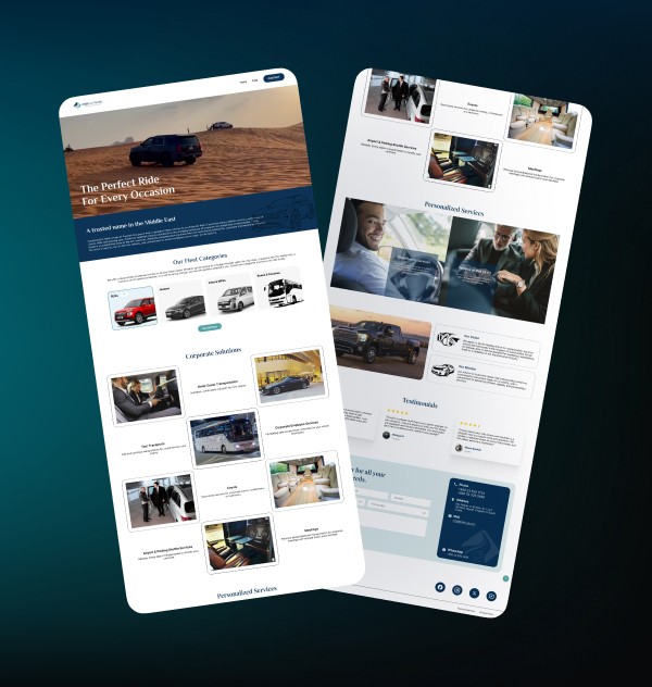
Droob Sa’s existing platform needed refinement to improve clarity, consistency, and overall usability. While the core product was functional, the experience lacked structure and made it harder for users to explore services and complete key actions.
The goal was to enhance the experience through UI improvements, better navigation, and optimized flows—without changing the core system or brand identity.
Problems Identified
The existing experience made it difficult for users to explore services and complete key actions smoothly. Unclear navigation and inefficient interaction flows led to confusion and lower engagement across the platform.
Unclear Navigation & Structure: Users struggled to move across pages and find relevant services due to inconsistent layout and lack of clear hierarchy
Friction in Key Flows: Booking and inquiry steps required extra effort, making it harder for users to complete actions and reducing overall engagement
Approach
I started with a quick audit of the existing platform to identify usability gaps and areas affecting engagement. Instead of rebuilding the system, the focus was on refining what already existed—improving clarity, simplifying interactions, and enhancing overall usability.
Changes were applied iteratively across layout, navigation, and key flows, while also updating sections in Wix to improve performance and basic SEO visibility.
Key Decisions
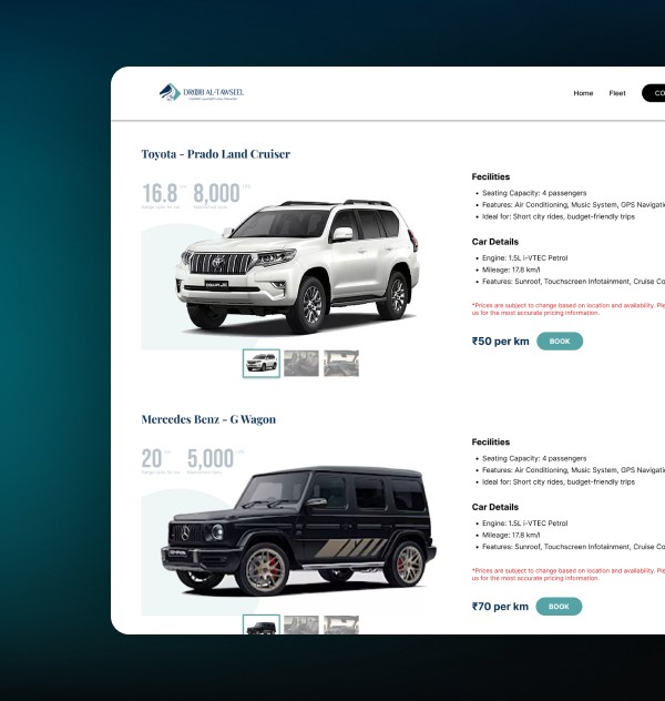
Refine Instead of Rebuild: Improved the existing system by enhancing structure, clarity, and usability without changing the core foundation
Simplified Navigation & Flows: Reduced complexity in menus and streamlined booking and inquiry steps for smoother user movement
Consistent & Clear UI: Standardized layouts, interactions, and CTAs to create a more predictable and user-friendly experience
5+ min
Engagement
+18%
Conversion Rate
4.5+
User Satisfaction
Impact
Higher Engagement: Users spent more time actively exploring services and content across key sections
Improved Conversion: Streamlined flows and clearer CTAs increased inquiry and booking actions
Better Usability: Clearer layouts and simplified navigation reduced friction and improved task completion

After struggling with our previous website, the rebuild significantly improved the experience. The platform is now intuitive, visually consistent, and much easier to manage. SEO improvements have also helped drive more traffic.

MD Tito
Chairman | Picano Art
Conclusion
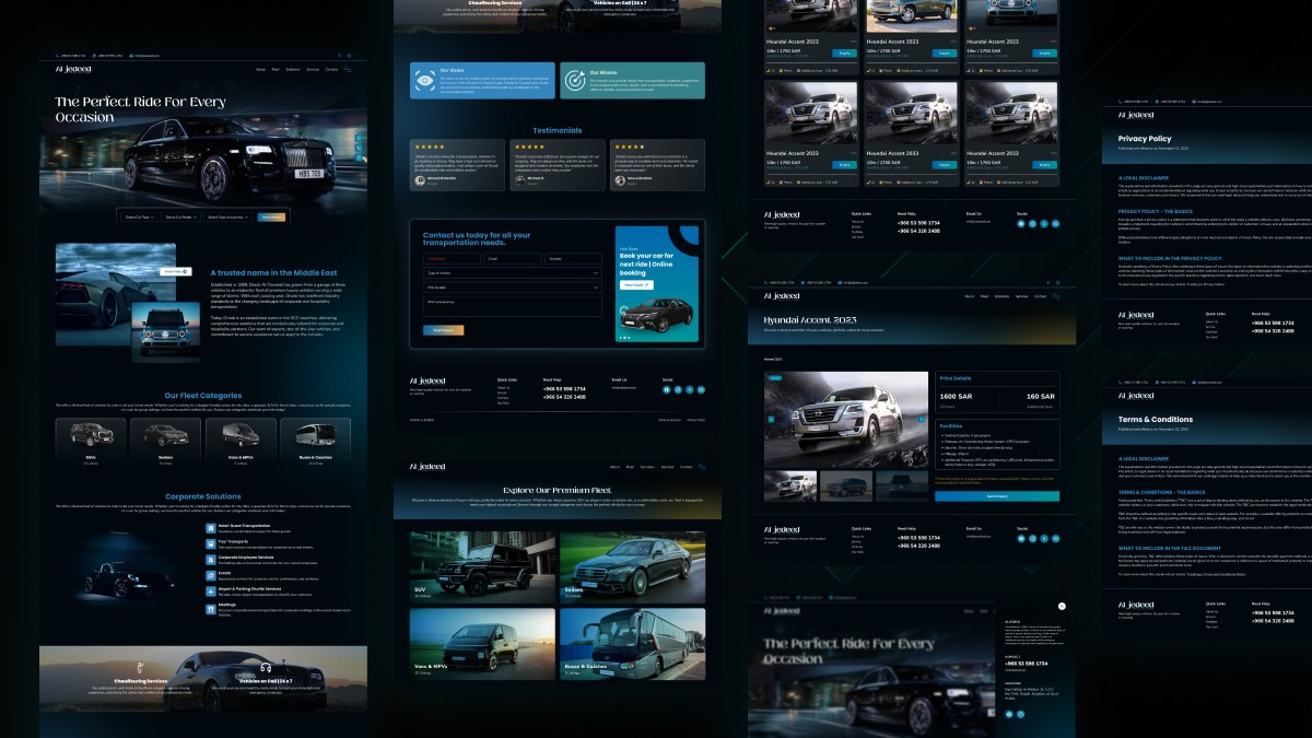
Droob Sa is now a more refined and user-friendly platform, with improved structure, clearer navigation, and better-performing flows—leading to higher engagement and more effective user interactions.
/ More Works

Let’s build something meaningful
Open to product roles, collaborations, and conversations
Droob Sa — Refining a Travel Car Rental Experience
Improved an existing travel car rental platform through UX refinements, clearer structure, and performance optimization—making the experience more usable and conversion-friendly.
Type:
Client
Role:
UX/UI Designer · Web Developer
Timeline:
Focus:
UX/UI Design · Web Development · SEO
Overview
Droob Sa’s existing platform needed refinement to improve clarity, consistency, and overall usability. While the core product was functional, the experience lacked structure and made it harder for users to explore services and complete key actions.
The goal was to enhance the experience through UI improvements, better navigation, and optimized flows—without changing the core system or brand identity.
Problems Identified
The existing experience made it difficult for users to explore services and complete key actions smoothly. Unclear navigation and inefficient interaction flows led to confusion and lower engagement across the platform.
Unclear Navigation & Structure: Users struggled to move across pages and find relevant services due to inconsistent layout and lack of clear hierarchy
Friction in Key Flows: Booking and inquiry steps required extra effort, making it harder for users to complete actions and reducing overall engagement
Approach
I started with a quick audit of the existing platform to identify usability gaps and areas affecting engagement. Instead of rebuilding the system, the focus was on refining what already existed—improving clarity, simplifying interactions, and enhancing overall usability.
Changes were applied iteratively across layout, navigation, and key flows, while also updating sections in Wix to improve performance and basic SEO visibility.
Key Decisions
Refine Instead of Rebuild: Improved the existing system by enhancing structure, clarity, and usability without changing the core foundation
Simplified Navigation & Flows: Reduced complexity in menus and streamlined booking and inquiry steps for smoother user movement
Consistent & Clear UI: Standardized layouts, interactions, and CTAs to create a more predictable and user-friendly experience
5+ min
Engagement
+18%
Conversion Rate
4.5+
User Satisfaction
Impact
Higher Engagement: Users spent more time actively exploring services and content across key sections
Improved Conversion: Streamlined flows and clearer CTAs increased inquiry and booking actions
Better Usability: Clearer layouts and simplified navigation reduced friction and improved task completion
After struggling with our previous website, the rebuild significantly improved the experience. The platform is now intuitive, visually consistent, and much easier to manage. SEO improvements have also helped drive more traffic.
MD Tito
Chairman | Picano Art
Conclusion
Droob Sa is now a more refined and user-friendly platform, with improved structure, clearer navigation, and better-performing flows—leading to higher engagement and more effective user interactions.
/ More Works
Let’s build something meaningful
Open to product roles, collaborations, and conversations
Droob Sa — Refining a Travel Car Rental Experience
Improved an existing travel car rental platform through UX refinements, clearer structure, and performance optimization—making the experience more usable and conversion-friendly.
Type:
Client
Role:
UX/UI Designer · Web Developer
Timeline:
Focus:
UX/UI Design · Web Development · SEO
Overview
Droob Sa’s existing platform needed refinement to improve clarity, consistency, and overall usability. While the core product was functional, the experience lacked structure and made it harder for users to explore services and complete key actions.
The goal was to enhance the experience through UI improvements, better navigation, and optimized flows—without changing the core system or brand identity.
Problems Identified
The existing experience made it difficult for users to explore services and complete key actions smoothly. Unclear navigation and inefficient interaction flows led to confusion and lower engagement across the platform.
Unclear Navigation & Structure: Users struggled to move across pages and find relevant services due to inconsistent layout and lack of clear hierarchy
Friction in Key Flows: Booking and inquiry steps required extra effort, making it harder for users to complete actions and reducing overall engagement
Approach
I started with a quick audit of the existing platform to identify usability gaps and areas affecting engagement. Instead of rebuilding the system, the focus was on refining what already existed—improving clarity, simplifying interactions, and enhancing overall usability.
Changes were applied iteratively across layout, navigation, and key flows, while also updating sections in Wix to improve performance and basic SEO visibility.
Key Decisions
Refine Instead of Rebuild: Improved the existing system by enhancing structure, clarity, and usability without changing the core foundation
Simplified Navigation & Flows: Reduced complexity in menus and streamlined booking and inquiry steps for smoother user movement
Consistent & Clear UI: Standardized layouts, interactions, and CTAs to create a more predictable and user-friendly experience
5+ min
Engagement
+18%
Conversion Rate
4.5+
User Satisfaction
Impact
Higher Engagement: Users spent more time actively exploring services and content across key sections
Improved Conversion: Streamlined flows and clearer CTAs increased inquiry and booking actions
Better Usability: Clearer layouts and simplified navigation reduced friction and improved task completion
After struggling with our previous website, the rebuild significantly improved the experience. The platform is now intuitive, visually consistent, and much easier to manage. SEO improvements have also helped drive more traffic.
MD Tito
Chairman | Picano Art
Conclusion
Droob Sa is now a more refined and user-friendly platform, with improved structure, clearer navigation, and better-performing flows—leading to higher engagement and more effective user interactions.
/ More Works
Let’s build something meaningful
Open to product roles, collaborations, and conversations